UI Design Kit (Figma)
If you have to start from zero, designing a complete and delightful user experience can be overwhelming. The free and open source UI Design Kit (Figma) includes screens and components you can use as starting point for designing your own ecommerce experiences.
How to use the UI kit?
If you want to see all components and pages:
- Go to the Figma community page and click Duplicate to add the UI kit to your Figma account.
- Open the UI kit in Figma.
- Go to the ▶️ Get started: Search & Discovery page to see how the resources are organized and learn how you can customize them to match your needs and brand guidelines.
- Go to the 🎨 Brand page and change the basic design elements: logos, colors, typography, icons, and screens.
Guiding principles
The UI kit follows these principles:
- Mobile-first design with rich experiences on larger device screens
- Neutral UI and modular components that are customizable to your brand
- Designed for omnichannel experiences to support today’s user journeys across multiple devices
- Unified search results and browse pages for a unique and seamless experience
- Incorporate UI/UX best practices from Algolia’s expertise backed by research and guidelines from industry leaders, for example, Google’s UX playbook, Baymard Institute
- Inspired by Atomic Design. Putting components at the center of the design system enables a smooth implementation in modern component-centric frameworks like React or Vue.js.
What’s included in the UI kit?
The Search and Discovery UI Kit includes mobile-first responsive pages for:
- Homepage
- Multi-category autocomplete
- Search and browse product listing
- Filter and sort panel
- Product detail with recommendations
Homepage
A dynamic home page allows shoppers to engage with navigation and search and discover personalized content according to their preferences, navigation history across devices, and trending searches.
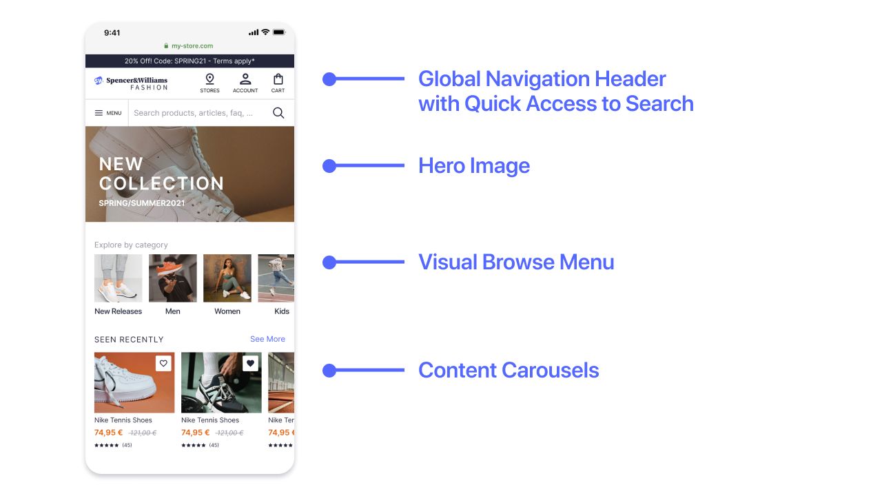
Global navigation header
All pages show a global navigation header with access to the main menu and search.
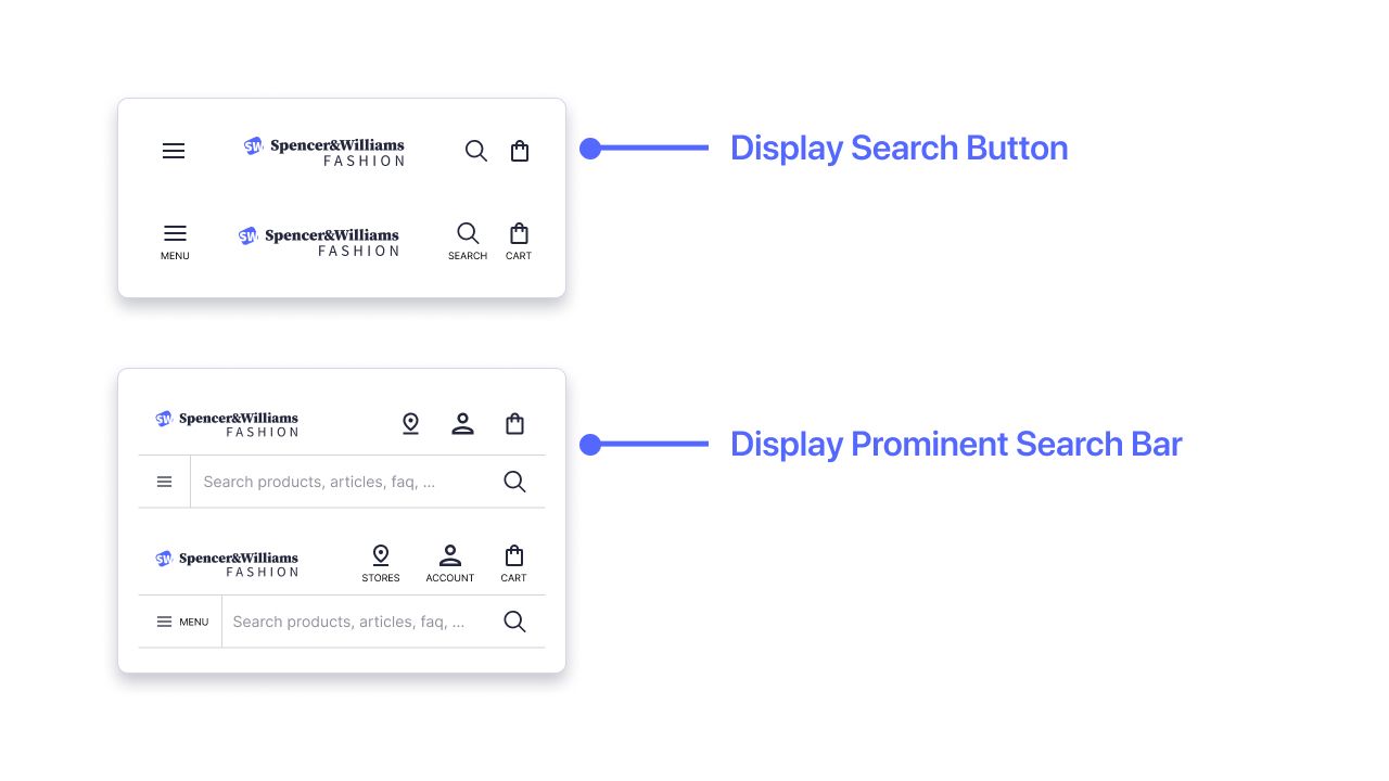
Depending on your needs, you can show the search as:
- Search button: suitable for compact headers. This option provides direct access to search and the shopping cart but relies on the menu for everything else, such as the user account or a store finder.
- Prominent search bar: suitable for web stores with large inventories or complex categories. This option shows a search bar on all pages and provides direct access to extra functions, such as the user account or a store finder.
Multi-category autocomplete
Build an all-in-one federated search experience with a full-page autocomplete overlay available in three main states:
- Empty query state
- Search state
- No search results state
Empty query state
As soon as the user interacts with the search box, the empty query state offers users a great opportunity to:
- Resume an earlier search, including searches performed on a different device.
- Discover new products by selecting trending searches or selecting a promoted content tile.
- Access other resources such as a store finder or an FAQ.
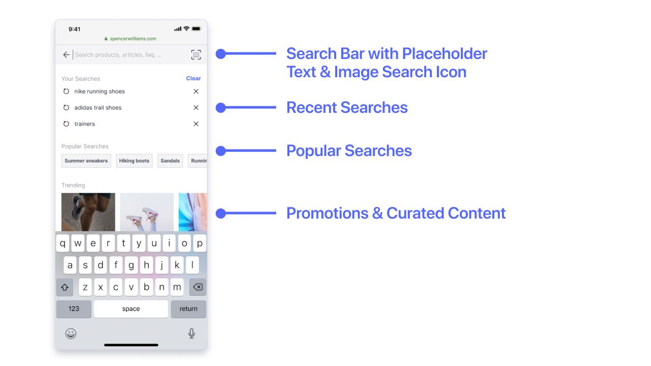
The search box at the top optimizes the display of the search results for the limited space once the keyboard opens.
See the Autocomplete documentation for more information.
The image search feature is increasingly popular on fashion and retail ecommerce websites. Depending on how you implement image search, users can explore similar-looking products or find a specific product based on its barcode or QR code. For example, users can scan a product’s code in a retail store and check a description of it and other variations online.
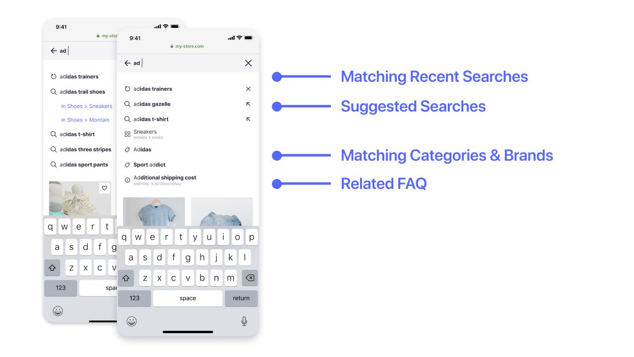
Search state
With autocomplete, users get a mix of results across different content types at every keystroke. The results adapt to their affinity profile but also earlier searches. Users can either jump to a product or article they find interesting or continue to a product listing page after selecting a query term, a brand, or a category.
Search and browse product listing
Users expect the same experience, whether they explore products on the search results page or browse products from a category page. That’s why both pages follow the same structure and incorporate the same functionality.
Search results page
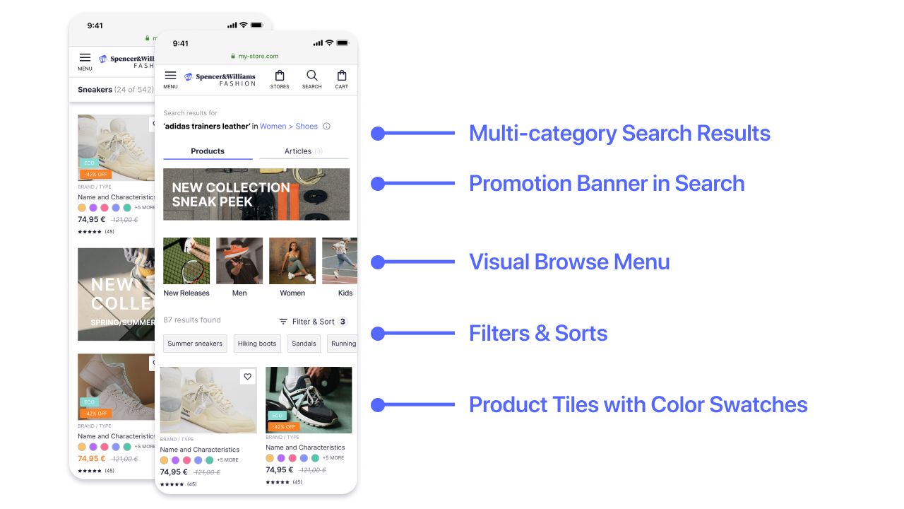
Give your users access to all relevant content from multiple categories in a single view, such as blog articles or shopping guides.
To enrich the user experience, you can display a promotion banner in the search results. Depending on the context, you can show banners, based on search queries, current category, or set of filters.
For example, you can display:
- A visual banner promoting a given brand on queries containing that brand name
- A banner “Learn about Free Delivery and Return policy” on the queries “delivery” or “return”
- A “Get to the Size” guide on query “size” or “size help”
Browse page
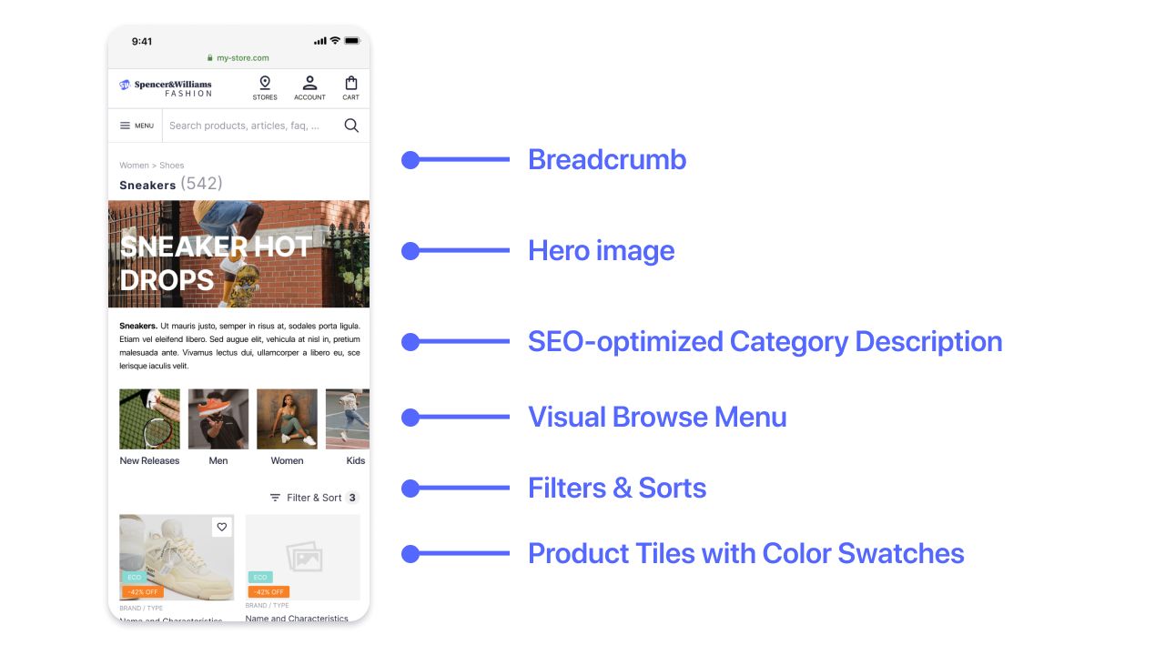
Breadcrumbs are as crucial for users as for SEO. They enable users to:
- Understand where they are in your website’s content hierarchy
- Get back to the parent pages with a single tap or click
Magazine layout
Like a traditional paper magazine, the magazine layout complements product listing tiles with rich content tiles that show editorial or promotional content.
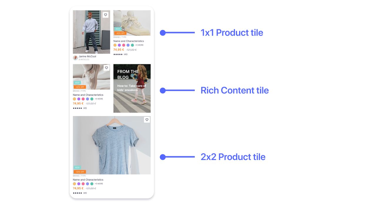
Mixing content types increases diversity, which helps to break up long product listings. The magazine layout also exposes more content to the users, which helps with their exploration and evaluation, leading them to buy quicker.
You can promote brands by displaying:
- Promoted products
- Promoted rich content
- Suggested filters or captured user preferences, such as size or color
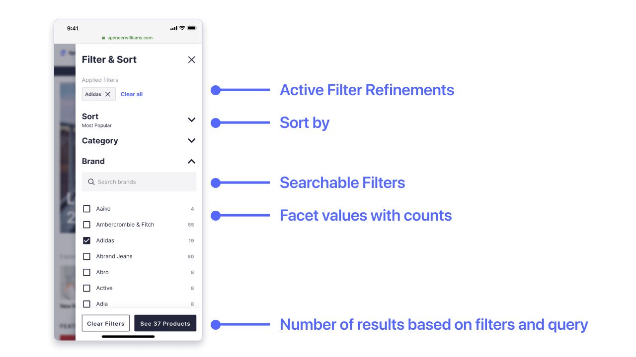
Filter and sort panel
As a vital part of the product listing page, the filter and sort panel shows the available refinements for the current search results. At the same time, the user has complete control to sort and refine the listed products.
Product detail page with recommendations
Showing recommended products is a great way to increase the average order value by bringing more items to the users’ attention.
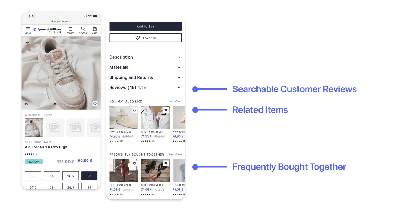
Searchable customer reviews
Shoppers rely more than ever on other shoppers’ reviews and inputs. Users can search through reviews using keywords and filters, for example, rating, user profile, or language.
To implement searchable reviews, add the reviews as a new index and use InstantSearch to implement the front-end experience.
Related items
Maximize conversions and catalog exposure by using collaborative filtering recommendations.
Frequently bought together
Increase cross-selling by showing products that complement the current selection.